My Impressions of Google Wave

Google Wave was in the news the last week, Sept. 30th was the date that platform was opened to the wider developer community. The actual big news event was last May when they presented a demo at their developers conference. The video of that demo is an hour and 20 minutes long, but quite illuminating. I sat down over the weekend and watched it, expecting it to be a slog, but it was quite entertaining.

While watching it, I took some notes, and what follows is a digested version of my immediate responses to the demo.

First off is that all of these web services have on main flaw, a single point of failure, i.e., network connectivity (either yours or Google’s). If, for instance, you use Google hosted services for your Wave conversations, if your Internet is down, you’re dead in the water. Of course, if your Internet is down, you also can’t receive email, so perhaps that’s not so big a deal, but the advantages of Wave come in the real-time and near-real-time collaboration, whereas email suffers very little from the latency problem that a local internet connection failure imposes.

Google certainly has big pipes to and from their servers and lots of redundancy, but they occastionally do have failures in some of their apps that cause them to be unreachable or slow. But consider if you decide to run your own Wave server — likely you would do so on a commercial hosting service rather than on your local office’s servers, but either way, you’re again in the situation where a crucial app is network-based, and only as reliable as the networks you depend on.

Embedding the Wave in a Blog:
Is just anyone allowed to participate in a WAVE embedded in the blog, or do you have to have user authentication in place?

SPELLCHECK DEMO
Brilliant application of their Google search spelling algorithms, but how often does it actually fuck up?

IM MODEL
The default is edits are immediately visible, indeed, they haven’t even built the feature to hide immediate updates. If you have a 10% rate of comments that you don’t want others to see, how many times will you end up accidentally sharing something you don’t want others to see until you’ve finished it? It seems to me, this makes it necessary to be very aware of the nature of the communication before you initiate it, and with certain people you’d want the default to be HIDE updates until SEND, while with others, you’d you’d want it to default to immediate.

A complicated problem, and one that will, I think, cause endless problems for end users — how many people pay for the email services that allow you to undo SEND in an email?

EXTENSIONS vs. ROBOTS
The presentation has confused me. I thought I understood the difference, but now I’m confused. They mentioned a distinction that a robot was server-side and an extension client-side, but the demo of Polly the Pollster seemed to obscure this — I feel less distinction now than I did before going into the example. Perhaps this because they’ve successfully abstracted the underlying technology so that to the user the difference is undetectable.

MORE CONFUSION
At the conclusion of the robot demo, Lars says “OK, that’s EXTENSIONS for you” (1:04), which just goes to show that I’m not the only one who is confused.

The difference is clearly server-side vs. client-side:

  1. an extension runs in the client. Updates to it get passed to the server as part of the wave and distributed through the normal wave distribution process.
  2. a robot is code running on the server that waits to see something pass by it in the wave that triggers its server-side behavior, whatever that may happen to be.
  3. robots have client-side UI elements that dump relevent XML into the wave that will then trigger the server-side action from the robot.
  4. thus, robots are client-side extensions that modify the wave plus a server-side process that reacts to those changes to the wave stream.

So, robots and extensions are *not* two different things. A robot is just an extension paired with server-side actions/

SECURITY/CONTENT CONTROL
While it might seem tempting to integrate a Wave into a website, the problem is the same with the Wave as with SideWiki — you don’t have control. It’s collaborative, so you have all the problems that come with collaboration, where everyone is equal and nobody gets veto power. That is, unless they’ve actually engineered it for superusers who have the privilege of editing the way, i.e., removing from the playback those things that they don’t want part of the permanent record.

IMPORTANCE OF DEVELOPERS
Interesting that the conclusion of the talk is Google’s realization of the importance of developers in making a platform successful. This is something MS always understood, something that Apple has only imperfectly understood, and something that this video shows Google is obviously coming to understand.
Why I Still Despise Apple

I’m not generally anti-Apple — I admire much of what they have done in making high-quality products and still do — but today I had problems with Safari for Windows 3.0.x crashing on me, so I figured it was time to upgrade to the latest. So, I Googled for it and came to the download page:

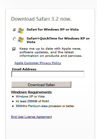
Safari Download Choices

Note the choices. First, email is checked off by default, whereas an honorable company would leave it *unchecked*. Secondly, there are two choices, plain Safari and Safari with QuickTime. Now, plain Safari is what is checked, and that’s good, since why in the hell do I want or need to download and install an update to QuickTime just to get Safari? At least it’s not bundled with iTunes as the QuickTime download once was.

OK, not too annoying, just uncheck the email and get on with the download. Wait! What’s this? The installer name is “SafariQuickTimeSetup.exe” — better cancel the setup and try again, since I must have accidentally failed to select the right radio button in the option group. OK, try it again, and, yes, the file for the *non*-QuickTime installer is definitely named “SafariQuickTimeSetup.exe.” Oh, well, must be some annoying thing they do, and I’d guess the other installer is different (or maybe the files have a different source but are given the same name on download. Or something).

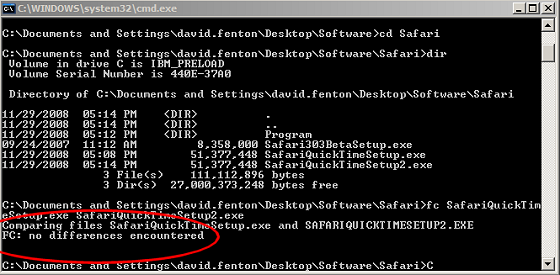
Curious now, I start the download of the QT version and go on with the install from the original file. Well! Turns out the so-called non-QT installer *does* install QuickTime. And when I do a file compare of the two installers:

Safari Installer Files Comparison

well, what a shock — a file compare of the two files shows that they are IDENTICAL.

To add insult to injury, the installer puts a QuickTime link and a Safari link in my Quick Launch bar on my Windows TaskBar — the installer should have asked for permission to do that, not just do it by default. Who the fuck needs a shortcut to QuickTime anywhere on their computer? When does *anyone* launch the content viewer instead of letting the OS launch the appropriate app according to the content you want to view?

I cannot *stand* this kind of behavior. First, I end up not getting what I asked for and then it installs things I didn’t want in the first place (and thought I was avoiding). And didn’t give me any choices about those things (not that at this point I’d even trust it to honor those choices…).

Last of all, making things worse still, I suspected that the installer probably put a system tray (MS keeps telling us that it’s not the “system tray” but the “notification area,” but I don’t give a crap) icon launcher in the Run line in my System Registry, so I fire up RegEdit and, yep, there it is, in all it’s glory — not only does Apple think I need a useless icon in my Quick Launch toolbar, but I also need another useless icon in the system tray. That is, I need TWO USELESS ICONS in my TaskBar from which I can launch QuickTime, but never ever *will*.

What is *wrong* with these people? Don’t they use computers? Don’t they recognize the pollution of the system tray and the Quick Launch toolbar that is endemic, with program after program installing their icons there for no good purpose? Well, no good purpose for the user of the computer — it’s an advertisement for the software, but that doesn’t do *me* any good.

To be fair to Apple, they are certainly not the only ones sticking icons where I don’t want them. But I must say I’ve never seen such a blatant overriding of the end users’ wants and needs as a download page that gives you the same installer regardless of which you choose. Assuming this is not simply a coding error on the download page, that kind of autocratic approach is exactly why long-time Windows users like me can never ever recommend Apple products — because Apple lies to you, telling you you’re in control and then doing whatever it pleases in the background.

Google’s Chrome

When I first tried it last week, I was very impressed by its incredibly speed. But now all I’m impressed with is it’s extremely piggy memory footprint (lipstick or no).

I browse my daily blogs in a set of 16 bookmarked tabs, and Firefox tends to bog down with that, using up to 128MBs of RAM. Depending on what’s in the pages (Flash, Java applets, badly written Javascript), it can really bog things down terribly and lead to awful paging slowdowns (I’m working with a memory-poor machine, WinXP with only .5 GBs of RAM for now). So, I thought maybe Chrome would address that.

I really should have known better than to think that! It was clearly announced that Chrome launches separate processes for each tab, but it didn’t occur to me that this would incur a huge penalty in duplication of code and vastly up the memory requirements. When I first tested the 16 tabs in Chrome, it killed my system before I killed Chrome when it exceeded 300MBs of total memory usage.

But I still thought there was a place for Chrome for running problematic pages that often bring Firefox (and WinXP) to a standstill. One of those is Air America steaming live broadcast feed, which has been very problematic (it’s bad enough in having connection blocking problems which I’ve only been able to fix by killing its connections through my software firewall, but also occasionally goes into the bad memory spiral, causing Firefox to just increase and increase its memory usage), and I thought that perhaps running it in Chrome would be the answer.

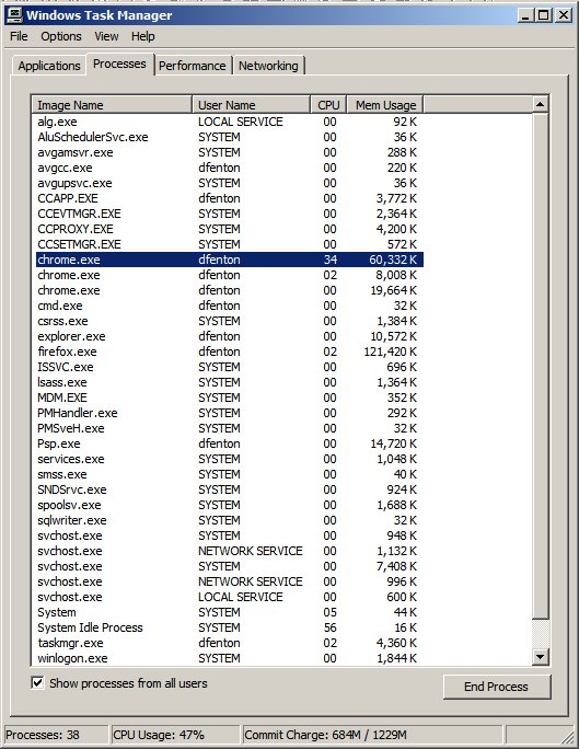
Well, at this moment, the only thing running in Chrome is http://AirAmerica.com/Listen/, yet, here’s a screenshot of Task Manager showing Chrome’s memory usage:

Task Manager

There are THREE Chrome processes just to support one window with one tab, and it’s using 89MBs of RAM!!! Firefox is currently running with 3 windows with 14 total tabs open, and it’s using only one process and 144MBs. If I want a memory-hogging browser with process separation, I’ve already got one in IE! Why do I need another one?

Updated: And I forgot about the GoogleUpdate process that the Chrome installer puts in the Run key of your registry so that a useless process is always running, insuring that you are always going to be annoyed whenever Google decides to nag you about updating their software. I removed the Run item so it doesn’t load at boot, but then noticed yesterday that GoogleUpdate loads if you run Chrome. So, I changed the permissions on the GoogleUpdate executable to DENY access 100% for everyone.

It’s sad that Google thinks they need to do this and opt everyone into automatic updates by default, but sadder still that they don’t allow any form of opt out unless you are something of a computer guru. If Google really does believe in it’s putative “do no evil” mantra, they aren’t demonstrating it with behavior like this.

Is Google in Danger of Falling from the Top of the Search Engine Heap?

Robert Cringely posts an article today on the subject of Google’s $4.6 billion offer to buy the 700MHz wireless spectrum. In the course of writing about this, he incidentally makes an interesting assertion:

Bill Gates likes to talk about how fragile is Microsoft’s supposed monopoly and how it could disappear in a very short period of time. Well Microsoft is a Pyramid of Giza compared to Google, whose success is dependent on us not changing our favorite search engine.

Now, I’m not sure that’s Google’s only advantage — they have their fingers in a lot of pies, not least of which is ad delivery. But I’m more interested in the question of whether Google is or is not the best search engine. I did some testing recently, motivated by a James Fallows article about a study of search engines financed by Dogpile.com (a search engine aggregator). The conclusion reached by the study was that no individual search engine is providing complete results, so you need a search engine aggregator to get the full picture.

I don’t think the conclusions are correct, because the study’s methodology was based on unique URLs, rather than testing whether or not the results were useful to a human being or not. I sent the following email to Fallows (the spreadsheet referred to in the text is here — sorry about the awful MS-generated HTML, as I didn’t have the time to redo it properly).

There’s a couple of big problems with the story:

  1. if you run a search on Google, Yahoo, Ask and Live and then run the same search on Dogpile, the Dogpile results do not actually replicate what shows up in the search engines it’s claiming to include.
  2. Dogpile returns a lot of bogus search results.

Attached is a spreadsheet that tallies up what’s going on for “antiquarian music,” a search term of interest to a client of mine (I am their webmaster, programmer and IT support person). What it shows:

  1. Eight of the 20 results on Dogpile’s first page are IRRELEVANT to the sought-after results. All 10 of the results on the first page of the four search engines are relevant (though not all equally so).
  2. None of the Ask.com results are included, despite the fact that Dogpile’s search page claims that it’s searching Ask.com.

Now, about the individual search results:

Google is by far the most relevant. While it doubles up for two sites, all the other results are relevant, being legitimate antiquarian music dealers. The only exception is the last entry from the Ex Libris mailing list (antiquarian librarians), which is actually an announcement of a catalog the dealer listed #9, so if #9 is relevant, I think that one is, too — it certainly gives you information directing you to an antiquarian music dealer.

Yahoo includes two links to Harvard Library pages that are not useful (they aren’t selling anything), as well as a link to Theodore Front and Schott, both of whom are music publishers/distributors that no longer sell any antiquarian music materials. It also includes the Antiquarian Funks, a Dutch musical group, which obviously doesn’t belong, though it takes more than simple computer knowledge to understand that (though Google seems smart enough to figure it out!).

Ask.com adds Katzbichler, a music antiquarian in Munich who doesn’t appear in the top 10 results of others, but also includes a worthless link to antiquarian music books on toplivemusic.com, which has nothing at all on it that is relevant to the search. It also gives top billing to Schott, who really offers no significant antiquarian music materials. It also includes a link to a republication of the Open Directory’s (DMoz.org) listing for antiquarian music. These listings are republished all over the net and basically just replicate links already found in the main listings.

Live.com also includes the Schott link, as well as two links to the American Antiquarian Society’s page on sheet music. This may or may not be relevant, but that would depend on the individual user. I doubt someone looking for antiquarian sheet music would fail to leave out the term “sheet music” in a search, and someone looking for antiquarian music dealers would not be helped by these links. It also includes the Antiquarian Funks and the unhelpful open directory category listing.

So, in short, for this particular search:

  1. Dogpile
    a. misrepresents the results (it doesn’t include what it says it does).
    b. Dogpile does a worse job than any of the individual search engines in providing useful links.
  2. Of the individual search engines, Google provides clearly superior results, as it filters out several links that don’t belong (e.g., Schott, Theodore Front, Antiquarian Funks), though how Google knows such complex information is tough to say.

So, for this particular search, the conclusions of the cited study do not apply. I would expect that there are a number of such searches for which that is the case.

I cannot tell from the description of methodology what could cause this kind of discrepancy, but I am bothered by this on p. 11 of the PDF about the study:

When the display URL on one engine exactly matched the display URL from one or more engines of the other engines a duplicate match was recorded for that keyword.

The problem with that is that it doesn’t distinguish equivalent links that could differ. A deep-linked page might be just as useful to a searcher as a link to the home page of an entire website — this would depend on the type of website and the type of search. In the case of my spreadsheet, I counted all links to any of the websites as equivalent, no matter which page was linked, because for this particular search, that’s the way a human being would treat them.

So, I would say that this emphasis on unique URLs is going to skew the results for certain classes of websites and for certain types of searches. Yes, a search that takes you to a specific article on the Washington Post’s website is going to be much more helpful than a link to the paper’s home page, but for searches like my example, that’s just not the case.

Secondly, the emphasis on unique URLs would also not reflect different methods of the different search engines in eliminating duplicates. There can be more than one path to the same information, and if all the search engines do not choose the same path, those URLs would be counted by the study mechanism as different, rather than providing the exact same information.

This study was designed in a way that was guaranteed to make a meta search engine like Dogpile appear to be better. But that is simply not true because of the methodology used — it is a statistical ghost produced by over-reliance on computer-based determination of URL identity, instead of evaluating from a human being’s point of view for equivalent value in different URLs.

Browser Tests — Mozilla Phoenix (Predecessor of Firefox)

Well, I’ve tried the Phoenix browser for a few days now. Phoenix is a stripped-down browser built on top of the Mozilla code base (download it from here). It is extraordinarily fast. But in nearly every other respect, Mozilla is much more usable. The creators of Phoenix have implemented a philosophy that end users don’t need all the features that Mozilla provides so they’ve made choices about how things should work. The problem is that, for me, they’ve made the wrong choices. One of the best features of Mozilla is the tabbed browsing. In the original implementation, typing a URL into the Location box automatically opened the URL in a new tab, but then the Mozilla team changed that so that you had to hit Ctrl-Enter to open in a new tab. The Phoenix team have retained the original behavior, and I really hate it. I prefer to re-use tabs. For example, when I read Salon, I open the main page, then open new tabs for all the articles I want to read. Then I go back to the Salon main page and want to go to Slate and do the same with that. With Phoenix, I need to close the original Salon tab and move to the new Slate tab. This is annoying.

Two other areas really annoy me, the History window and passwords. I absolutely despise the practice that IE implemented of opening the history in a pane on the left of your browser window. If I browsed full-screen, this would make a certain amount of sense. If browsers did not hit the remote server again when they reformatted the page you are viewing, this would make a certain amount of sense (Mozilla is good in that it does not hit the server again, just uses the cached version). But I almost never browse full-screen. I prefer a browser window that is as tall as the whole vertical space above the TaskBar and as wide as about 2/3s of the screen. This gives a good line length on most pages while leaving room for other windows to be visible behind it. But when you hit Ctrl-H in IE or Phoenix, about 1/5th of your window gets taken up with the history pane, and that means that the document window is now too narrow, while the history window is too narrow to be useful. In Mozilla, you can do something that opens the History window in its own window, rather than in a “sidebar,” as the Mozilla team calls these panes. But in Phoenix that capability has not been implemented. Also, in Phoenix, they do not allow you to display the history in ungrouped layout, like the old Netscape 4.x history list (which I vastly prefer). This makes using the history list in Phoenix very unpleasant. I have checked to see if it is possible to change prefs.js or one of the preference files to fix this, but have had no luck with the history window (I was able to change the cache location with that method).

The other thing that drives me crazy is that you can’t tell Phoenix to never remember any passwords at all. I am philosophically opposed to a password manager and so in Mozilla (and IE) I tell the browser to never remember any passwords at all. In Phoenix, your only choices when you type a password is “Remember this password/don’t remember this password/don’t remember any passwords for this site.” The result is that I have to take the last choice for every password site I visit. Perhaps there’s something in prefs.js that would allow me to set it to never remember passwords at all, but at this point, what with Phoenix not saving a cookie for my Salon premium membership so that I have to log in every damned time, I just can’t be bothered. There are simply too many capabilities that are not there in Phoenix, capabilities that I think users need, even novice users. Simplifying the PREFERENCES dialog may seem like a great help, but, in fact, it really isn’t. Choosing good default settings is crucial for non-technical users. But the browser needs to be adjustable in areas that affect usability. Phoenix makes it much too hard to have a decent, personalized browsing experience.