Why I Still Despise Apple

I’m not generally anti-Apple — I admire much of what they have done in making high-quality products and still do — but today I had problems with Safari for Windows 3.0.x crashing on me, so I figured it was time to upgrade to the latest. So, I Googled for it and came to the download page:

Safari Download Choices

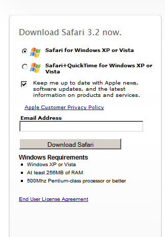
Note the choices. First, email is checked off by default, whereas an honorable company would leave it *unchecked*. Secondly, there are two choices, plain Safari and Safari with QuickTime. Now, plain Safari is what is checked, and that’s good, since why in the hell do I want or need to download and install an update to QuickTime just to get Safari? At least it’s not bundled with iTunes as the QuickTime download once was.

OK, not too annoying, just uncheck the email and get on with the download. Wait! What’s this? The installer name is “SafariQuickTimeSetup.exe” — better cancel the setup and try again, since I must have accidentally failed to select the right radio button in the option group. OK, try it again, and, yes, the file for the *non*-QuickTime installer is definitely named “SafariQuickTimeSetup.exe.” Oh, well, must be some annoying thing they do, and I’d guess the other installer is different (or maybe the files have a different source but are given the same name on download. Or something).

Curious now, I start the download of the QT version and go on with the install from the original file. Well! Turns out the so-called non-QT installer *does* install QuickTime. And when I do a file compare of the two installers:

Safari Installer Files Comparison

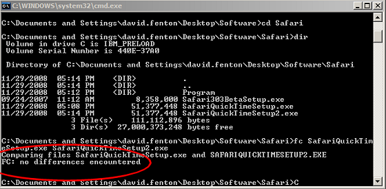
well, what a shock — a file compare of the two files shows that they are IDENTICAL.

To add insult to injury, the installer puts a QuickTime link and a Safari link in my Quick Launch bar on my Windows TaskBar — the installer should have asked for permission to do that, not just do it by default. Who the fuck needs a shortcut to QuickTime anywhere on their computer? When does *anyone* launch the content viewer instead of letting the OS launch the appropriate app according to the content you want to view?

I cannot *stand* this kind of behavior. First, I end up not getting what I asked for and then it installs things I didn’t want in the first place (and thought I was avoiding). And didn’t give me any choices about those things (not that at this point I’d even trust it to honor those choices…).

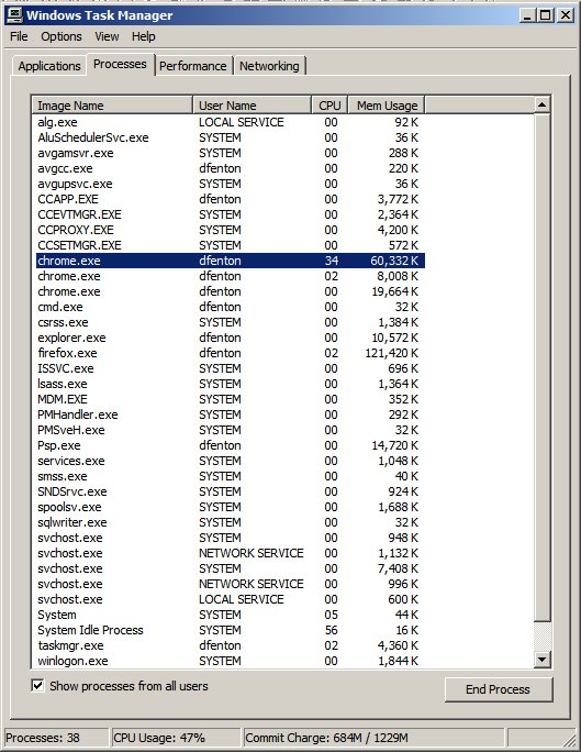
Last of all, making things worse still, I suspected that the installer probably put a system tray (MS keeps telling us that it’s not the “system tray” but the “notification area,” but I don’t give a crap) icon launcher in the Run line in my System Registry, so I fire up RegEdit and, yep, there it is, in all it’s glory — not only does Apple think I need a useless icon in my Quick Launch toolbar, but I also need another useless icon in the system tray. That is, I need TWO USELESS ICONS in my TaskBar from which I can launch QuickTime, but never ever *will*.

What is *wrong* with these people? Don’t they use computers? Don’t they recognize the pollution of the system tray and the Quick Launch toolbar that is endemic, with program after program installing their icons there for no good purpose? Well, no good purpose for the user of the computer — it’s an advertisement for the software, but that doesn’t do *me* any good.

To be fair to Apple, they are certainly not the only ones sticking icons where I don’t want them. But I must say I’ve never seen such a blatant overriding of the end users’ wants and needs as a download page that gives you the same installer regardless of which you choose. Assuming this is not simply a coding error on the download page, that kind of autocratic approach is exactly why long-time Windows users like me can never ever recommend Apple products — because Apple lies to you, telling you you’re in control and then doing whatever it pleases in the background.

Google’s Chrome

When I first tried it last week, I was very impressed by its incredibly speed. But now all I’m impressed with is it’s extremely piggy memory footprint (lipstick or no).

I browse my daily blogs in a set of 16 bookmarked tabs, and Firefox tends to bog down with that, using up to 128MBs of RAM. Depending on what’s in the pages (Flash, Java applets, badly written Javascript), it can really bog things down terribly and lead to awful paging slowdowns (I’m working with a memory-poor machine, WinXP with only .5 GBs of RAM for now). So, I thought maybe Chrome would address that.

I really should have known better than to think that! It was clearly announced that Chrome launches separate processes for each tab, but it didn’t occur to me that this would incur a huge penalty in duplication of code and vastly up the memory requirements. When I first tested the 16 tabs in Chrome, it killed my system before I killed Chrome when it exceeded 300MBs of total memory usage.

But I still thought there was a place for Chrome for running problematic pages that often bring Firefox (and WinXP) to a standstill. One of those is Air America steaming live broadcast feed, which has been very problematic (it’s bad enough in having connection blocking problems which I’ve only been able to fix by killing its connections through my software firewall, but also occasionally goes into the bad memory spiral, causing Firefox to just increase and increase its memory usage), and I thought that perhaps running it in Chrome would be the answer.

Well, at this moment, the only thing running in Chrome is http://AirAmerica.com/Listen/, yet, here’s a screenshot of Task Manager showing Chrome’s memory usage:

Task Manager

There are THREE Chrome processes just to support one window with one tab, and it’s using 89MBs of RAM!!! Firefox is currently running with 3 windows with 14 total tabs open, and it’s using only one process and 144MBs. If I want a memory-hogging browser with process separation, I’ve already got one in IE! Why do I need another one?

Updated: And I forgot about the GoogleUpdate process that the Chrome installer puts in the Run key of your registry so that a useless process is always running, insuring that you are always going to be annoyed whenever Google decides to nag you about updating their software. I removed the Run item so it doesn’t load at boot, but then noticed yesterday that GoogleUpdate loads if you run Chrome. So, I changed the permissions on the GoogleUpdate executable to DENY access 100% for everyone.

It’s sad that Google thinks they need to do this and opt everyone into automatic updates by default, but sadder still that they don’t allow any form of opt out unless you are something of a computer guru. If Google really does believe in it’s putative “do no evil” mantra, they aren’t demonstrating it with behavior like this.

Browser Tests — Mozilla Phoenix (Predecessor of Firefox)

Well, I’ve tried the Phoenix browser for a few days now. Phoenix is a stripped-down browser built on top of the Mozilla code base (download it from here). It is extraordinarily fast. But in nearly every other respect, Mozilla is much more usable. The creators of Phoenix have implemented a philosophy that end users don’t need all the features that Mozilla provides so they’ve made choices about how things should work. The problem is that, for me, they’ve made the wrong choices. One of the best features of Mozilla is the tabbed browsing. In the original implementation, typing a URL into the Location box automatically opened the URL in a new tab, but then the Mozilla team changed that so that you had to hit Ctrl-Enter to open in a new tab. The Phoenix team have retained the original behavior, and I really hate it. I prefer to re-use tabs. For example, when I read Salon, I open the main page, then open new tabs for all the articles I want to read. Then I go back to the Salon main page and want to go to Slate and do the same with that. With Phoenix, I need to close the original Salon tab and move to the new Slate tab. This is annoying.

Two other areas really annoy me, the History window and passwords. I absolutely despise the practice that IE implemented of opening the history in a pane on the left of your browser window. If I browsed full-screen, this would make a certain amount of sense. If browsers did not hit the remote server again when they reformatted the page you are viewing, this would make a certain amount of sense (Mozilla is good in that it does not hit the server again, just uses the cached version). But I almost never browse full-screen. I prefer a browser window that is as tall as the whole vertical space above the TaskBar and as wide as about 2/3s of the screen. This gives a good line length on most pages while leaving room for other windows to be visible behind it. But when you hit Ctrl-H in IE or Phoenix, about 1/5th of your window gets taken up with the history pane, and that means that the document window is now too narrow, while the history window is too narrow to be useful. In Mozilla, you can do something that opens the History window in its own window, rather than in a “sidebar,” as the Mozilla team calls these panes. But in Phoenix that capability has not been implemented. Also, in Phoenix, they do not allow you to display the history in ungrouped layout, like the old Netscape 4.x history list (which I vastly prefer). This makes using the history list in Phoenix very unpleasant. I have checked to see if it is possible to change prefs.js or one of the preference files to fix this, but have had no luck with the history window (I was able to change the cache location with that method).

The other thing that drives me crazy is that you can’t tell Phoenix to never remember any passwords at all. I am philosophically opposed to a password manager and so in Mozilla (and IE) I tell the browser to never remember any passwords at all. In Phoenix, your only choices when you type a password is “Remember this password/don’t remember this password/don’t remember any passwords for this site.” The result is that I have to take the last choice for every password site I visit. Perhaps there’s something in prefs.js that would allow me to set it to never remember passwords at all, but at this point, what with Phoenix not saving a cookie for my Salon premium membership so that I have to log in every damned time, I just can’t be bothered. There are simply too many capabilities that are not there in Phoenix, capabilities that I think users need, even novice users. Simplifying the PREFERENCES dialog may seem like a great help, but, in fact, it really isn’t. Choosing good default settings is crucial for non-technical users. But the browser needs to be adjustable in areas that affect usability. Phoenix makes it much too hard to have a decent, personalized browsing experience.